The concept of grid-by-design far predates the philosophies of web development. While the NotCot’s and StumbleUpon’s of today may exhibit grid elements in creative ways, the bees, the bridge builders and the chess masters have known the secret of the grid for centuries. Mother nature can construct a grid, alright, but here are 10 examples of creative grid-based designs on some of the world’s most beautiful websites. Enjoy, and the next time you find yourself staring at the rows and columns of an excel spreadsheet, may this TheCoolist feature brighten your perspective a bit.
Special Note– the numeration on each item below is only to help you navigate, and not to rate the quality of these websites in a toplist form.
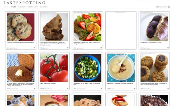
1. TasteSpotting.com | A Community-Driven Visual Potluck
View in gallery Presentation is an integral part of an enlightened culinary experience. Some of the greatest meals we’ve experienced are as pleasing to the eye as they are to the tongue. The people at TasteSpotting understand this maxim, having built their web community on a visual appreciation of food. To organize their content in a clear, accessible way, TasteSpotting.com employs a variable-width column grid layout of images and text. Each unit features a 250×250 image of visually appealing food with a short description below. Click through to be taken to the story’s source, in this case submitted by the TasteSpotting community itself. Fans of NotCot.org will find this approach familiar, albeit a bit too familiar for comfort. That aside, the community and content of TasteSpotting.com makes a brilliant use of the grid concept– to the point that any food lover owes it to themselves to pay a daily visit. [visit TasteSpotting.com]
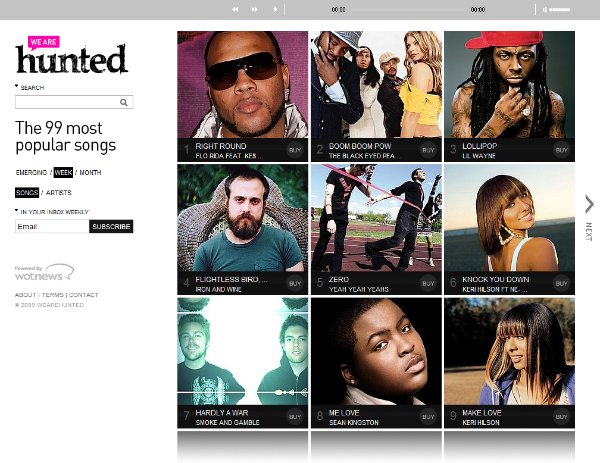
2. WeAreHunted | The Online Music Chart
View in gallery Like food, visual presentation has a strong impact on the music we listen to or purchase. Sure, the visual element is not necessary, but the album cover has become an important part of the fan experience. The online music chart website WeAreHunted has taken a fresh approach to displaying the web’s most popular music– by showing album art in a grid-style design. In contrast to the design of WeAreHunted, the Billboard Chart seems more similar to a newspaper stock chart than a proper way of following the industry’s most popular talent. The concept is simple– the 99 most popular songs on the web are organized in a 3×3 grid that navigates horizontally in 11 pages. Sort by week, month, and new songs or artists, WeAreHunted displays what’s hot and relevant to you. The result is a very easy, organic list of today’s hits with a built in player for instant, full-length previews. [visit wearehunted]
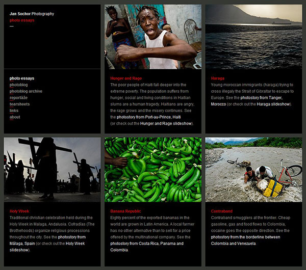
3. Jan Sochor | Photo Essays
View in gallery Photographer Jan Sochor sees modern life through a perspective which most of us would find shocking, disheartening, but most of all enlightening. To display his work in a clear, clean fashion, Jan Sochor has used a grid-style website layout with a dark gray background and bold, black item sections. Even without his content, Jan Sochor’s website allows for a decidedly human navigation flow. With most grid-style websites of this sort, the user can quickly select the content that interests them most, saving time for what is most important to them. Structure aside, Jan Sochor’s works deserve plenty of attention. Through his lense, he has captured an unrestricted view of the human struggle just South of our so-called civilized life. He shows in his work the daily struggle that is life in some parts of South America. Ironically, the struggles portrayed in these images are seemingly done in servitude of a common lifestyle in America. [visit jansochor]
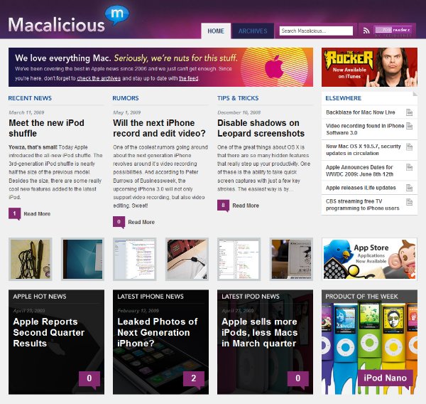
4. Macalicious | Apple, Mac and iPod News
View in gallery Mac users are visually-oriented by nature. Some use their Macs for visual productivity including graphic design, film editing or photography, others simply prefer the visual aesthetic its OS and apps provide. Macalicious caters to the visual-oriented Mac user by providing news about all things Apple in a brilliant graphical layout. Specifically, a grid-style website layout. Unlike most of the other sites on this list, Macalicious employs a short length grid layout. The four columns of this website have three focused on content and one on navigation and advertising. The result works brilliantly for this site’s content. As a result, Macalicious provides a well organized and accessible magazine to an informed, design-conscious audience. [visit macalicious]
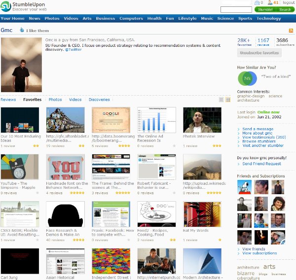
5. StumbleUpon | Yeah, That StumbleUpon
View in gallery The internet’s greatest web discovery tool is also one of its greatest exhibitors of the column-style grid. StumbleUpon.com‘s user profiles display a user’s favorites in a five column grid, showing a thumbnail/title/rating view of the web pages they are interested in. Long-time stumblers love this layout, as it provides a birds-eye view of all the brilliant stuff their friends are thumbing up every day. For more, take a look at the StumbleUpon profile of the company’s founder and CEO, Garrett Camp. [visit stumbleupon]
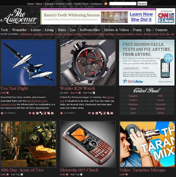
6. TheAwesomer | Awesome Stuff
View in gallery TheAwesomer‘s website is just that– awesome, a collection of awesome stuff from around the web. From gadgets to cars to video games to clothing, TheAwesomer is a magazine for men that uses a fresh 3-column grid format to display “awesome stuff”. TheAwesomer is a good example of the amount of navigation and usability elements that can be employed in the column-style grid. In this case, TheAwesomer has fit an image, a link to the item’s single page, a link to the item’s source, a short description, the post’s ratings and social media buttons. While some may see TheAwesomer as a bit busy in design, its tag and category based navigation in the header give the user a wide range of options to sort the content to be displayed in TheAwesomer’s grid. [visit TheAwesomer]
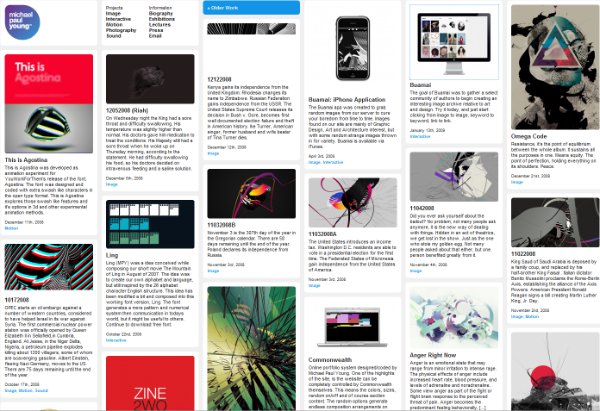
7. MichaelPaulYoung | A Grid Portfolio
View in gallery Graphic designer Michael Paul Young knows the virtues of the grid firsthand. For his personal portfolio website, Young used a fresh take on the column-style grid– where the columns are static, but the rows are variable based on the content. With that, the length of the content item is based on the image and text, and the resulting column layout looks mixed, organic and varied. Of course, such a design matters little unless the content is attractive. In Michael Paul Young’s sense, his site is a homerun right out of the park. His graphic design work is vibrant, both gemoetric and organic at the same time, a collection of eye candy for the casual visitor and design pro alike. You’ll enjoy it as well… [visit michaelpaulyoung]
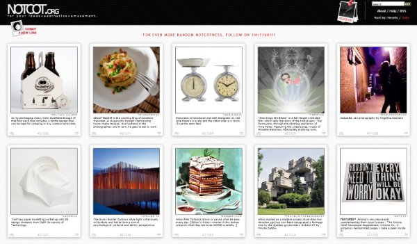
8. NotCot | For Your Ideas, Aesthetics, Amusement
View in gallery The NotCot group of websites have based their model around two things: the column grid design and community-based content. Their work has been a clear success on the web, with one of the most informed and loyal design communities online today. Their community is invited to submit content that they find inspiring, beautiful, progressive and inventive– which the editors of NotCot then approve or decline. The NotEmpire includes a series of websites based on the column grid, including a fashion website, a cocktail website, the NotCot main site and the NotCot.com blog. The result is the most complete, aesthetically conscious collection of grid-based design websites available on the web today.
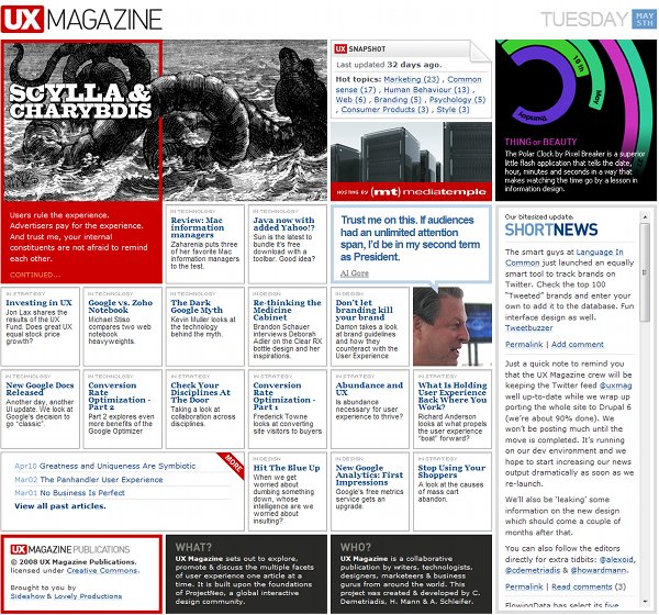
9. UXmag | The User Experience Mag
View in gallery If the web’s User Experience magazine has chosen the column grid to display their content, that’s one hell of a vote of confidence for the format. UXmag.com uses an even, unit-styled grid theme where columns and/or rows can overlap into multiples of two. The result is a column-style grid format that uses connected units to give emphasis to featured content. The content of UXmag.com has a focus on web usability, marketing, human behavior and their collective interaction within web software. From conversion rate studies to web analytics to shopper psychology, UXmag is a publication about the science of human interaction with web systems and how to optimize the data side to fit the human element. Its a great read for all you web-is-human/human-is-web science buffs… [visit UXmag]
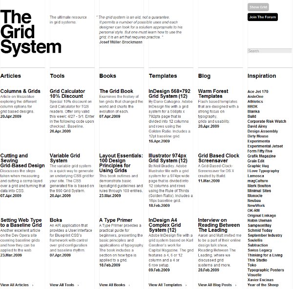
10. TheGridSystem | The Ultimate Resource in Grid Systems
View in gallery Among the ultimate column-style grid websites is an organization created to study and develop grid themes in design. TheGridSystem.org is a publication that provides news, tips and techniques in grid design to a wide audience of readers. Designers and grid fans will find a healthy collection of knowledge, insight and inspiration into the grid system of web design, and a series of links to websites that exhibit these philosophies in progressive ways. – – – – –
Want to learn more about the grid system yourself? TheGridSystem.org is the first place to start. Beyond that, here are a collection of websites we suggest you visit to learn the fully history and application of the grid in web design:
The Grid Page Layout on WikipediaAbout.com’s Grid Design InformationMaking and Breaking the Grid (book)960.gs Grid System collectiveMadeByOn, the developer of TheCoolist.comGridalicious, a free grid-style wordpress themeGrid-Focus, a free grid-style wordpress themeEquilibrium, a free grid-style wordpress theme
[main image courtesy: sarahkim]